Wednesday, 2 February 2011

Type...

After much debate, I have changed the font to sans- serif (Baskerville).
  • I think it is more formal so fits with the target audience and it makes it look "old- fashioned" fitting with my victorian style silhouette illustrations.
  • Gives the impression that these tips have been tried and tested: passed down from generation to generation. This links with the fact that I personally asked people for their money saving top tip.
  • The fact that the illustrations are black and white means that it can be printed and made really cheaply: for the debt advisers and their clients they will be more interested in the content rather than the appearance, although this does still matter as it need to be appealing

Final Crit 02/02/11

  • Choose font in relation to audience
  • Decide on audience- a cheap or free book for a hard- up audience or a beautifully produced art book for an audience of collectors?

Curatorship:

Curator
noun
a keeper or custodian of a museum or other collection.
Curator Responsibilities:http://en.wikipedia.org/wiki/Curator

In smaller organizations, a curator may have sole responsibility for the acquisition and care of objects. The curator will make decisions regarding what objects to collect, oversee their care and documentation, conduct research based on the collection, provide proper packaging of art for transport, and share that research with the public and scholarly community through exhibitions and publications. In very small volunteer-based museums, such as local historical societies, a curator may be the only paid staff member.

In larger institutions, the curator's primary function is as a subject specialist, with the expectation that he or she will conduct original research on objects and guide the organization in its collecting. Such institutions can have multiple curators, each assigned to a specific collecting area (e.g. Curator of Ancient Art, Curator of Prints and Drawings, etc.) and often operating under the direction of a head curator. In such organizations, the physical care of the collection may be overseen by museum collections managers or museum conservators, and documentation and administrative matters (such as insurance and loans) are handled by a museum registrar.

Austerity

A great article from The Guardian newspaper on the 1st Feb about austerity:

http://www.guardian.co.uk/commentisfree/cifamerica/2011/feb/01/economy-economics


Tuesday, 1 February 2011

Laser Cutter

For the exhibition on the 11th February, Katy and I are making and selling jewellery and key rings. Today we booked two sessions on the laser cutter to cut out the robot, polar bear, owl and squirrel. The robot and polar bear were cut form acrylic plastic and the others were cut from wood. We wanted to cut more form the wood material but for some reason we always have difficulty with it...

Sunday, 30 January 2011


I found the "don't smoke" illustration quite difficult as i didn't want it too look like a no- smoking sign- i thought that it would be too obvious. I decided just to keep it simple and draw a packet of cigarettes, all the straight, parallel lines proved a challenge though!

Saturday, 29 January 2011

Popcorn

Layout...


the layout of the book so far.


Type...

I'm undecided as to what font to use- serif or sans-serif. At the moment I'm thinking a sans-serif as they create sharp shapes with defined edges. This would mimic the silhouette drawings. My favourite so far is Trebuchet MS so will use this until the crit next Tuesday and ask people's opinions...

Top Ten Tips

  1. Packed Lunch (start on this one as it has an illustration)
  2. Drink tap water
  3. extra layer of clothing
  4. Don't leave thing on standby
  5. share lifts
  6. Walk/ cycle
  7. share a bath (illustration)
  8. don't snack
  9. Don't leave tap running when brushing teeth
  10. Stick to a budget (end on this one...opens up rest of book)

Layout...


It took much longer than I expected to work out which picture would go where on the page. But luckily I allowed time for it. In the end i decided on having one picture on the left side with one tip and 3 or more tips on the right with no picture. However, the following issues came up:
  • because the book was split into sections (Food, shopping etc) it worked out that there were more illustrations for one section while less for others making the illustration/ tip ratio uneven and messy. I decided to add another section- "Top Ten Tips" to solve the problem.
  • I need more illustrations than anticipated

Friday, 28 January 2011


Categories

I have decided to place my top- tips in the following groups:
1. Food
2. Shopping
3. Health and Beauty
4. Around the House
5. Kids and Pets
6. Leisure
7. Finance

Cold Meat and How To Disguise It- HUnter Davies


I looked at many books and found this book by Hunter Davies on amazon. The book was practical, old- fashioned and down-to-earth. I used it to help me decide on the sections in my book, what should go under what category etc. The chapters in his book were:

1. Food
2. Domestic
3. Children
4. Clothing
5. Health
6. DIY
7. Money
8. Transport

Wednesday, 26 January 2011

Before Final Crit:

For next week:
  1. all illustrations drawn
  2. digital copy of first draft of book for final crit
  3. some print-outs of pages for book for crit
  4. font ideas
  5. layout

Two more illustrations...

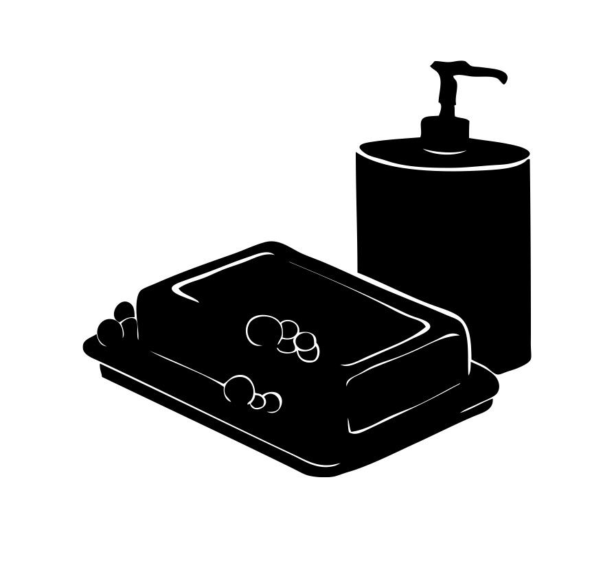
Lunch-box and soap dispenser illustrations

Now I have found a routine way to produce the illustrations I am finding the process a lot quicker:
  • First I hand draw the illustrations in my sketchbook with a pencil then go around the edge with a fine liner to make a clear and distinctive outline.
  • Then scan the image into Adobe Photoshop.
  • In Photoshop i adjust the image until it is in black and white using the selection wand and brush tool and a graphics tablet. From doing this i found out about selecting the inverse which meant I could get the fine white lines.
  • I then Live Traced the image in Adobe Illustrator
  • If there were any "wonky" circular or straight parts i used the pen tool to neaten them up and create a blunt/ sharp edge.
  • I would then keep flicking the the image back and forth between Photoshop and Illustrator until i was satisfied. (I had to remember that every time i adjusted the illustration in Photoshop i had to Live Trace it after to keep it looking sharp).

Friday, 21 January 2011

"Air dry your clothes instead of paying for a tumble dryer"

I wasn't happy with the final washing line design. Using a graphics tablet I made parts of the image, such as the pegs look, stronger by making the lines straighter etc.

Also, I originally decided to add some colour to the illustrations. I decided to experiment with colour as the images are monochrome. I wanted to use a single colour, such as green, to highlight a certain part of the image. However, I felt it didn't look right and made the images look a bit like a colouring book for kids. I asked others and they all agreed that the simple black and white images were better.


The simple, black and white image.

I also swapped the order of the clothes around and added a washing basket to add more "levels", making the images more interesting to look at.