
Monday 31 January 2011

Sunday 30 January 2011


Saturday 29 January 2011


Type...
I'm undecided as to what font to use- serif or sans-serif. At the moment I'm thinking a sans-serif as they create sharp shapes with defined edges. This would mimic the silhouette drawings. My favourite so far is Trebuchet MS so will use this until the crit next Tuesday and ask people's opinions...
Top Ten Tips
- Packed Lunch (start on this one as it has an illustration)
- Drink tap water
- extra layer of clothing
- Don't leave thing on standby
- share lifts
- Walk/ cycle
- share a bath (illustration)
- don't snack
- Don't leave tap running when brushing teeth
- Stick to a budget (end on this one...opens up rest of book)
Layout...


It took much longer than I expected to work out which picture would go where on the page. But luckily I allowed time for it. In the end i decided on having one picture on the left side with one tip and 3 or more tips on the right with no picture. However, the following issues came up:
- because the book was split into sections (Food, shopping etc) it worked out that there were more illustrations for one section while less for others making the illustration/ tip ratio uneven and messy. I decided to add another section- "Top Ten Tips" to solve the problem.
- I need more illustrations than anticipated
Friday 28 January 2011


Categories
I have decided to place my top- tips in the following groups:
1. Food
2. Shopping
3. Health and Beauty
4. Around the House
5. Kids and Pets
6. Leisure
7. Finance
Cold Meat and How To Disguise It- HUnter Davies

I looked at many books and found this book by Hunter Davies on amazon. The book was practical, old- fashioned and down-to-earth. I used it to help me decide on the sections in my book, what should go under what category etc. The chapters in his book were:
1. Food
2. Domestic
3. Children
4. Clothing
5. Health
6. DIY
7. Money
8. Transport
Thursday 27 January 2011

Wednesday 26 January 2011
Before Final Crit:
For next week:
- all illustrations drawn
- digital copy of first draft of book for final crit
- some print-outs of pages for book for crit
- font ideas
- layout
Two more illustrations...
Lunch-box and soap dispenser illustrations

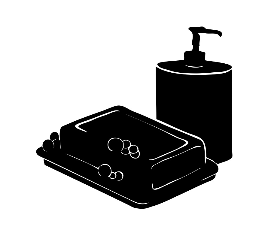
Now I have found a routine way to produce the illustrations I am finding the process a lot quicker:
- First I hand draw the illustrations in my sketchbook with a pencil then go around the edge with a fine liner to make a clear and distinctive outline.
- Then scan the image into Adobe Photoshop.
- In Photoshop i adjust the image until it is in black and white using the selection wand and brush tool and a graphics tablet. From doing this i found out about selecting the inverse which meant I could get the fine white lines.
- I then Live Traced the image in Adobe Illustrator
- If there were any "wonky" circular or straight parts i used the pen tool to neaten them up and create a blunt/ sharp edge.
- I would then keep flicking the the image back and forth between Photoshop and Illustrator until i was satisfied. (I had to remember that every time i adjusted the illustration in Photoshop i had to Live Trace it after to keep it looking sharp).
Friday 21 January 2011
"Air dry your clothes instead of paying for a tumble dryer"

I wasn't happy with the final washing line design. Using a graphics tablet I made parts of the image, such as the pegs look, stronger by making the lines straighter etc.
Also, I originally decided to add some colour to the illustrations. I decided to experiment with colour as the images are monochrome. I wanted to use a single colour, such as green, to highlight a certain part of the image. However, I felt it didn't look right and made the images look a bit like a colouring book for kids. I asked others and they all agreed that the simple black and white images were better.

The simple, black and white image.
I also swapped the order of the clothes around and added a washing basket to add more "levels", making the images more interesting to look at.
Thursday 20 January 2011
Another major problem I had was getting the bath picture right.
I couldn't get the lady's face right, but the major problems were the bubbles and the bath itself:

- I kept on tweaking the lady's face on the computer with a graphics tablet until i was happy with it. With the bath however, I just decided to start again.
- I learnt from Katy how to use the Pen and the Line tool in Adobe Illustrator.
- With these new found skills I lowered the opacity of my hand drawn sketch and created a new layer.
- On the new layer I constructed the bath with the pen and line tool.
- With the lowered opacity of the illustration I practically traced this illustration but the pen and line tools made the bath look sharper.
- I then live traced the image and continued adjusting it in Adobe Photoshop with a graphics tablet.

Wednesday 19 January 2011
Scrooge- neatened up
In my tutorial, David pointed out the the image quality was not as good as it could be. The illustrations were blurry and slightly grey around the edge in places. To get sort this out
- I Live Traced the image in Adobe Illustrator using the settings Simple Trace and in Black and White. The Simple Trace ensured sharper edges and the Black and White removed any grey patches.
- I also found the whole process a lot easier when using graphics tablet, something I had never used before.

Before: the pictures looked slightly grey around the edges and were not as neat as they could be. (the best example of this in this image is around the thumb)

After: Image much sharper
Tutorial 19/1/11
- illustrations need to be sharper- try out different methods
- how many illustrations will there be in total? - narrow down to 101 top tips
- think about book, layout, font etc


Saturday 15 January 2011
Waterstones
Went to Waterstones early this morning (to try and beat the mayhem on a Saturday) to look at what's already available in the way of money saving tip books:
- most of the books were specific, related to a certain topic area eg "The Money Saving Motorist" if my book was more broad/ general it would be more unique.
- a lot of the books were printed in full colour. This would make them more expensive to make and therefore more expensive to buy, not appealing to the target audience. I'm going to try and include as little colour as possible.


Thursday 13 January 2011

Wednesday 12 January 2011
Order of the tips
Alphabetically
or
by house- hold rooms:
- living room
- bedroom
- bathroom
- kitchen
- garage
- study
- play-room
or
by sections relevant:
- Pets
- Cooking
- Children
- Make-up
- Car
- Shopping
- Around the house
Tuesday 11 January 2011


Arthur Rackham 1867 –1939
Arthur Rackham silhouette illustrations... similar style to how i would like my illustrations to be.

Monday 10 January 2011

Friday 7 January 2011

Thursday 6 January 2011


Keswick Museum and Art Gallery
This museum and art gallery is well known for it's Victorian Collections. I went along to see if they had any silhouette illustrations:
Wednesday 5 January 2011


Tuesday 4 January 2011
Prime Minister's New Years Day Message
http://podcast.ulcc.ac.uk/accounts/Number10/DowningStreetPodcast/Ha7XyuPM_Podcast.mp3
This really fits with my concept for the brief.
2011 is going to be a difficult year, as we take hard but necessary steps to sort things out.
“But the actions we are taking are essential, because they are putting our economy and our country on the right path.
“Together, we can make 2011 the year that Britain gets back on its feet.”
Subscribe to:
Posts (Atom)