Thursday 10 February 2011

Evaluation

For the Visual Language brief I wanted to create a project that was based on using the Adobe suite as well as using more resources in college. I felt that this would help me to become more skilled in using the Adobe design program, something I have not yet fully achieved despite my many efforts in the past. Initially I wanted to try and include some animation in the project by creating a series of flipbooks, but I did not feel inspired by the topic and struggled to get started. I then decided to create a book with some form of text I could illustrate.

Similar to Communication Technology 2, it took me a while to get started properly on the brief. Although this time I did have an idea straight away, I think I rushed into it too quickly and did not ask myself whether I was motivated by what I was doing. This is really important in a brief, as an unmotivated piece of work is usually not finished to the higher standard. I finally decided to base my project on austerity: government cuts means that there are people struggling for money. This is an of-the-moment topic that I am interested in. I wanted to create a book informing struggling people ways to save money.

Before this project I felt I had inept skills with the Adobe suite. If I wanted to do something specific to a picture/ use a specific tool I would not have known how. Although I am no expert I am really pleased with the progress I have made. I have a firm understanding about how to go about adjustments on an image: I think that repeatedly adjusting my illustrations for the book has made the techniques sink in. However, I now need to keep using the skills learnt or I am likely to forget them. It is certainly a skill I need to keep practicing- a bit like learning to play a musical instrument.

Furthermore, I know more about bookbinding. I feel that with all the correct materials, I could now bind a book at home by myself. Unfortunately, I found the whole process to stressful. Before binding a lot of work goes into the book and one mistake and you have to start the process from the beginning and I have found out I am great a making mistakes at the last minute. I learnt I need to keep checking and re-checking that I have everything in order before I continue to the next step. Something I learnt the hard way. For example, at one point I sewed and glued one of the books’ signatures in the wrong place (the front to the back) a clumsy mistake I can easily avoid if I checked what I was doing more often. Luckily, it was salvageable. I also discovered that it is best to get someone other then myself to check for spelling mistakes as often you cannot spot your own mistakes.

During the brief I slightly changed my audience. The book was originally for people who were struggling for money to buy but I soon realised that why would someone with little money what to buy a book? I changed to a book for debt advisors to hand out to their clients for free. This indicated to me that it is often best to be really specific about the audience- narrow it down as much as possible. This makes is easier to produce a stronger outcome as the research is narrower and I you can get a better understanding instead of being vague. Everything is more precise and produced to a higher quality.

Generally, I feel I am quite an organised person. In the past I have tried not to leave anything to the last minute (I feel too guilty!) and manage to spread my workload out well by planning ahead. I think this is due to the fact that I have to feel I have worked hard and tried my best before I hand in a project. I want to feel content with what I have produced. I found the workload during this brief slightly more challenging though. It was not just the workload of Visual Language- I had many projects occurring at once, all of which had deadlines within a couple of weeks of on another. The key was balancing the work and mentally organising what should take priority at certain points in the week. For example, for the Send and Receive brief I had to leave Leeds (and college) for a couple of days while the Visual Language brief was also in action. I knew that if I focused on the Send and Receive brief for just those few days it would be practically be behind me so I let Visual Language be pushed to the back of my mind. I then gave all my attention to the Visual language brief once I was back in Leeds. I managed to get everything done in good time for the Visual Language brief, so was thankfully the right thing to have done.

Despite being reasonably organised I still managed to become stressed easily. I worry about what could go wrong and whether I will actually get all the work done in time. I learnt that the best way around this is to get up early in the morning so I know I have the whole day available, leaving plenty of time for things to go wrong. I also found that writing ‘goals’ (lists of things to get done by a certain time) helped me to manage my workload successfully and ensure that things got done to schedule. At first I just wrote them in my sketchbook but there I would not necessarily look at them regularly and it was easy to hide them away, so I decided to post them on my blog. If they were written on my blog others could see them. They seemed “set-in-stone” and made me fell like I had to get them done by the time I stated. This is a very successful new trick I have learnt and I will definitely be using it in the future.

Having my book printed and bound to schedule and slightly ahead of what I presumed meant I could help with the exhibition. I volunteered to be in the “curators” group and soon discovered that hanging an exhibition is a lot harder than it looks. We worked in pairs and Katy and I had an awkward wall to work with. One of the artists had a set of four photographs but we only had room for three. The photographer was not available to ask so we had to make an executive decision, something we were not expecting to have to do- we did not want to make a decision the photographer would be unhappy with. Once we had chosen and hanged the photographs we could not get them straight, despite using a spirit level. From this I discovered that the photographs themselves had not been cut straight. This revealed to us how important it is that the work is framed and mounted accurately otherwise it will look not look proficient when hung on the wall.

For the exhibition Katy and I worked collaboratively. We designed and hand-made jewellery to sell on a stall. We made £40 in total, which meant we broke even and still has some profit. This was not something we initially expected. We hoped that we would break-even but realistically it was a possibility that we would not: we did not know how many people would come to the exhibition so were therefore comprehensive. We were thrilled with the outcome and to expand the idea further we hope to participate in some local craft fairs and perhaps the book fair in March.

Overall, Visual Language has made me realise how important it is to be organised. If you get things done in good time it allows room for mistakes; helping to get the final product look as professional a possible. Although juggling the workload was a challenge, I realised that I actually enjoy having loads to do and being busy. It makes the final outcome seem more worthwhile and that you deserve a break at the end.

Exhibition

With a good team effort we managed to set up the exhibition on time. At the time i found it stressful as there seemed to be so much to do and i found hanging the artwork much hard then i thought i would. However, looking back i really enjoyed participating. It is definitely a worth while experience and i would look to do it again in the future!

For our stall we had to think about the following :
  • how they were going to be displayed
  • how much we were going to sell them for
  • float
  • commissions
Katy's and my stall... we used a turquoise piece of cloth and just spread all the necklaces out so the customers could see what was available. We also prepared a sheet of commissions where people could write down a shape that they wanted and we would do it for them. We did get a couple. As the evening went on we thought it was a good idea to write down what people were buying, see which were the favourite shapes... it worked out pretty even though.

We decided to sell the Necklaces for £3.00 and the key rings for £2.50. Other than the Vis. Com charity event before Christmas, we had never sold anything like it before so though we would test to see how popular they were. We made £40 selling our necklaces and key rings! We definitely weren't expecting to make so much! However in the future it would be a good idea to have some sort of business card as we had a lot of people wanting to buy more in the future. we ween't expecting it to be so successful so really didn't think about it!


Wednesday 9 February 2011

If i were to expand this project further i could possibly use the top tips i have created for:
  • a little section on a web page sharing advice to people. Possibly on debt advisors websites.
  • a newspaper. The images are in black and white so they would easily print. The best place would be to start in local papers such as the Lake District Herald and Keswick Reminder (both local papers in Cumbria)
or some more light heated ways would be to:
  • print the images and tips on badges for people to wear
  • print the images and tips on the back of a pack of playing cards.

Setting up the Exhibition

We were paired up (katy and i worked together) and had to chose a wall to work with. All the curators than laid out all the work and had to make a decision about what went best with what. Once we had chosen the work, we had to patch up the walls with paint... this was harder than it sounds as apparently there is more than one shade of white and took longer than expected. One of the major things we found was how important it is to, as an artist, to make sure you have framed and mounted your work straight. Katy and i spent ages with a set of three photographs trying to get them level and to fit neatly on the wall before we discovered a)the weren't the same size when at fist glance they look as if they are meant to be b) they hadn't been mounted straight. In the end we did the best job we could and decided to consult the artist.

Postcard for Exhibition

Tuesday 8 February 2011

Binding a book is stressful.

I have only been to two book binding workshops before and today I went to the print room to bind it by myself. My book has a soft cover and I had never done a book like this before. I also printed the front cover.
Key things I learnt from the binding process:
  • I didn't want page numbers on my book because I had numbered the tips and i thought there were too many numbers on one page and it was confusing for the eye. BUT page numbers make it much easier to work out the order when sewing. I made a big mistake which I luckily noticed just before it was too late- i sewed and glued a signature in the wrong place and i had to start the sewing again.
  • If possible, keep a spare piece of paper around the edge of it to try and keep the pages clean.
  • Its really important to get the spine width right once printed. My book was a lot smaller than the paper i had printed onto (allows a neater trim to right size) and it took a tedious amount of time to work out the correct measurements for everything- it all has to be very precise. The best thing is to stitch and glue the book , measure how big the spine has to be and then adjust the cover and print while the glue is drying.
printing and mounting the cover:
  • I could print on brown paper but i had to manually feed it
  • One of the tech. guys in the Vernon Street mac suites showed me how to create a cover on Photoshop- i had created mine in InDesign, but Photoshop is best

Monday 7 February 2011

a selection of debt advisor companies I have looked at:


and a local one in Leeds:


Jewellery Price...

We don't know how much to sell the Jewellery/ Keyrings at the exhibition for... we have done some market research but all the ones for sale in the shops are WAY too pricey for what we want (in ARK the wooden ones are £25!) http://www.arkclothing.com/Accessories/Jewellery/Necklaces/Stolen_Thunder_E_Initial_Necklace1.html

Printing

I printed my book this morning. I printed it in the digital print room in Blenheim, I had never used this resource before... I was shown how to send a Adobe InDesign book document to the printer with all my preferred settings. Key things to remember:
  • Package the InDesign document. This ensures the computer knows where all the images are kept and makes it much easier when printing
  • Work out how many signatures needed and send each one to the printer separately
  • Make sure the InDesign document size is the size you want it before printing


Final Cover

I asked around and everyone preferred this cover best...


..because:
  • positioning of the illustration
  • sideways 101 the same size as pig
I want to continue the black silhouette theme on the cover. However, I saw a sketchbook in a shop today which had brown paper as the cover. I really liked this aspect and thought it would suit my book: it is cheap yet effective as it reflects the 'cheap' idea.
I will need to think about:
  • size of the cover- the size of the spine/ the distance between the front and back when printing
  • whether brown paper will actually work in a printer or will i have to screen print?
  • brown paper is too thin as a cover for what i want to do, i will have to mount it on some thicker card.. is this possible when soft binding a book, or will it pucker?

Sunday 6 February 2011

Goals for this final week:
  1. MONDAY AM: (1) Print book (booked into Blenheim digital print 10am)
  2. TUESDAY: (1) Bind book (2) start assembling jewellery for exhibition (3) Print off postcard for exhibition (3)
  3. WEDNESDAY: (1) Help set up exhibition (2) Assemble jewellery
  4. THURSDAY: (1) Set up exhibition
  5. DEADLINE


Title

I originally wanted to call my book "101 Top Tips on How To Save Money" however, after doing research I thought that this was a bit obvious and... common.

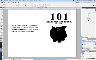
I decided to make it more of-the-moment and call it "101 Austerity Measures for 2011".

Austerity refers to the economic issues society is experiencing at the moment. I know it's not a common word, but as the book is aimed at debt advisor's customer's they will straight away realise the book's meaning.

Friday 4 February 2011

Popcorn 2

I found the popcorn image the most difficult to draw. It was hard to get the actual popcorn silhouette right as they don't really have a distinctive shape.

The first image is my original illustration. I thought it looked ok, and you could tell what it was, until I asked for feedback. Someone thought it was a burning skyscraper. Although it doesn't really matter if it's not obvious what the image is as the text will be supporting it, I still wanted to change it.

I went to the cinema and bought a pot of popcorn. I changed the image by making the cardboard popcorn box wider and the frills at the top edge of the box more stand out more. I also defined the shape of the actual popcorn and added some popcorn at the base of the box.

From this process I learnt that it is important to get feedback on what you are doing from others.

Honey Body Scrub 2


The top image was my original illustration for a honey jar. I asked people whether they could tell what was in the jar and they said it wasn't obvious, you had to take a while to work it out from the honey spoon.

To develop the image further it was suggested that I add a couple of bees into the illustration. I hand drew the bees then scanned and adjusted them as if it were one of the other images. Finally they were resized and placed onto the honey jar document in Photoshop before Live Tracing the image.

Thursday 3 February 2011

Things to do before print:
  1. Book session in digital print room
  2. Sort out type and layout
  3. Piggy bank illustration
  4. Washing car illustration
  5. Sock pupet illustration
  6. Sort out popcorn illustration
  7. Add bees to honey pot illustration
  8. FRONT COVER

Wednesday 2 February 2011

Audience

Originally I set out to create a book for people who are struggling in todays economic climate. However, if they where tight for money, why would they spend what little money they have on a book? From this realisation and after today's Crit, I have decided to make my target audience more specific:

  • I am creating the book for debt advisers to give out to clients for free. The debt advisor company will buy the books and give them to their struggling clients.

The black and white illustrations will make it cheaper to produce then full colour illustrations, an aspect which fits with the audience.

To also make the book cheap to produce, I want it to have a soft cover... something I have not done before.

Type...

After much debate, I have changed the font to sans- serif (Baskerville).
  • I think it is more formal so fits with the target audience and it makes it look "old- fashioned" fitting with my victorian style silhouette illustrations.
  • Gives the impression that these tips have been tried and tested: passed down from generation to generation. This links with the fact that I personally asked people for their money saving top tip.
  • The fact that the illustrations are black and white means that it can be printed and made really cheaply: for the debt advisers and their clients they will be more interested in the content rather than the appearance, although this does still matter as it need to be appealing

Final Crit 02/02/11

  • Choose font in relation to audience
  • Decide on audience- a cheap or free book for a hard- up audience or a beautifully produced art book for an audience of collectors?

Curatorship:

Curator
noun
a keeper or custodian of a museum or other collection.
Curator Responsibilities:http://en.wikipedia.org/wiki/Curator

In smaller organizations, a curator may have sole responsibility for the acquisition and care of objects. The curator will make decisions regarding what objects to collect, oversee their care and documentation, conduct research based on the collection, provide proper packaging of art for transport, and share that research with the public and scholarly community through exhibitions and publications. In very small volunteer-based museums, such as local historical societies, a curator may be the only paid staff member.

In larger institutions, the curator's primary function is as a subject specialist, with the expectation that he or she will conduct original research on objects and guide the organization in its collecting. Such institutions can have multiple curators, each assigned to a specific collecting area (e.g. Curator of Ancient Art, Curator of Prints and Drawings, etc.) and often operating under the direction of a head curator. In such organizations, the physical care of the collection may be overseen by museum collections managers or museum conservators, and documentation and administrative matters (such as insurance and loans) are handled by a museum registrar.

Austerity

A great article from The Guardian newspaper on the 1st Feb about austerity:

http://www.guardian.co.uk/commentisfree/cifamerica/2011/feb/01/economy-economics


Tuesday 1 February 2011

Laser Cutter

For the exhibition on the 11th February, Katy and I are making and selling jewellery and key rings. Today we booked two sessions on the laser cutter to cut out the robot, polar bear, owl and squirrel. The robot and polar bear were cut form acrylic plastic and the others were cut from wood. We wanted to cut more form the wood material but for some reason we always have difficulty with it...

Sunday 30 January 2011


I found the "don't smoke" illustration quite difficult as i didn't want it too look like a no- smoking sign- i thought that it would be too obvious. I decided just to keep it simple and draw a packet of cigarettes, all the straight, parallel lines proved a challenge though!

Saturday 29 January 2011

Popcorn

Layout...


the layout of the book so far.


Type...

I'm undecided as to what font to use- serif or sans-serif. At the moment I'm thinking a sans-serif as they create sharp shapes with defined edges. This would mimic the silhouette drawings. My favourite so far is Trebuchet MS so will use this until the crit next Tuesday and ask people's opinions...

Top Ten Tips

  1. Packed Lunch (start on this one as it has an illustration)
  2. Drink tap water
  3. extra layer of clothing
  4. Don't leave thing on standby
  5. share lifts
  6. Walk/ cycle
  7. share a bath (illustration)
  8. don't snack
  9. Don't leave tap running when brushing teeth
  10. Stick to a budget (end on this one...opens up rest of book)

Layout...


It took much longer than I expected to work out which picture would go where on the page. But luckily I allowed time for it. In the end i decided on having one picture on the left side with one tip and 3 or more tips on the right with no picture. However, the following issues came up:
  • because the book was split into sections (Food, shopping etc) it worked out that there were more illustrations for one section while less for others making the illustration/ tip ratio uneven and messy. I decided to add another section- "Top Ten Tips" to solve the problem.
  • I need more illustrations than anticipated

Friday 28 January 2011


Categories

I have decided to place my top- tips in the following groups:
1. Food
2. Shopping
3. Health and Beauty
4. Around the House
5. Kids and Pets
6. Leisure
7. Finance

Cold Meat and How To Disguise It- HUnter Davies


I looked at many books and found this book by Hunter Davies on amazon. The book was practical, old- fashioned and down-to-earth. I used it to help me decide on the sections in my book, what should go under what category etc. The chapters in his book were:

1. Food
2. Domestic
3. Children
4. Clothing
5. Health
6. DIY
7. Money
8. Transport

Wednesday 26 January 2011

Before Final Crit:

For next week:
  1. all illustrations drawn
  2. digital copy of first draft of book for final crit
  3. some print-outs of pages for book for crit
  4. font ideas
  5. layout

Two more illustrations...

Lunch-box and soap dispenser illustrations

Now I have found a routine way to produce the illustrations I am finding the process a lot quicker:
  • First I hand draw the illustrations in my sketchbook with a pencil then go around the edge with a fine liner to make a clear and distinctive outline.
  • Then scan the image into Adobe Photoshop.
  • In Photoshop i adjust the image until it is in black and white using the selection wand and brush tool and a graphics tablet. From doing this i found out about selecting the inverse which meant I could get the fine white lines.
  • I then Live Traced the image in Adobe Illustrator
  • If there were any "wonky" circular or straight parts i used the pen tool to neaten them up and create a blunt/ sharp edge.
  • I would then keep flicking the the image back and forth between Photoshop and Illustrator until i was satisfied. (I had to remember that every time i adjusted the illustration in Photoshop i had to Live Trace it after to keep it looking sharp).

Friday 21 January 2011

"Air dry your clothes instead of paying for a tumble dryer"

I wasn't happy with the final washing line design. Using a graphics tablet I made parts of the image, such as the pegs look, stronger by making the lines straighter etc.

Also, I originally decided to add some colour to the illustrations. I decided to experiment with colour as the images are monochrome. I wanted to use a single colour, such as green, to highlight a certain part of the image. However, I felt it didn't look right and made the images look a bit like a colouring book for kids. I asked others and they all agreed that the simple black and white images were better.


The simple, black and white image.

I also swapped the order of the clothes around and added a washing basket to add more "levels", making the images more interesting to look at.